Project
University live project
Industry
Ceramic Homeware
Duration
3 months

Concept.
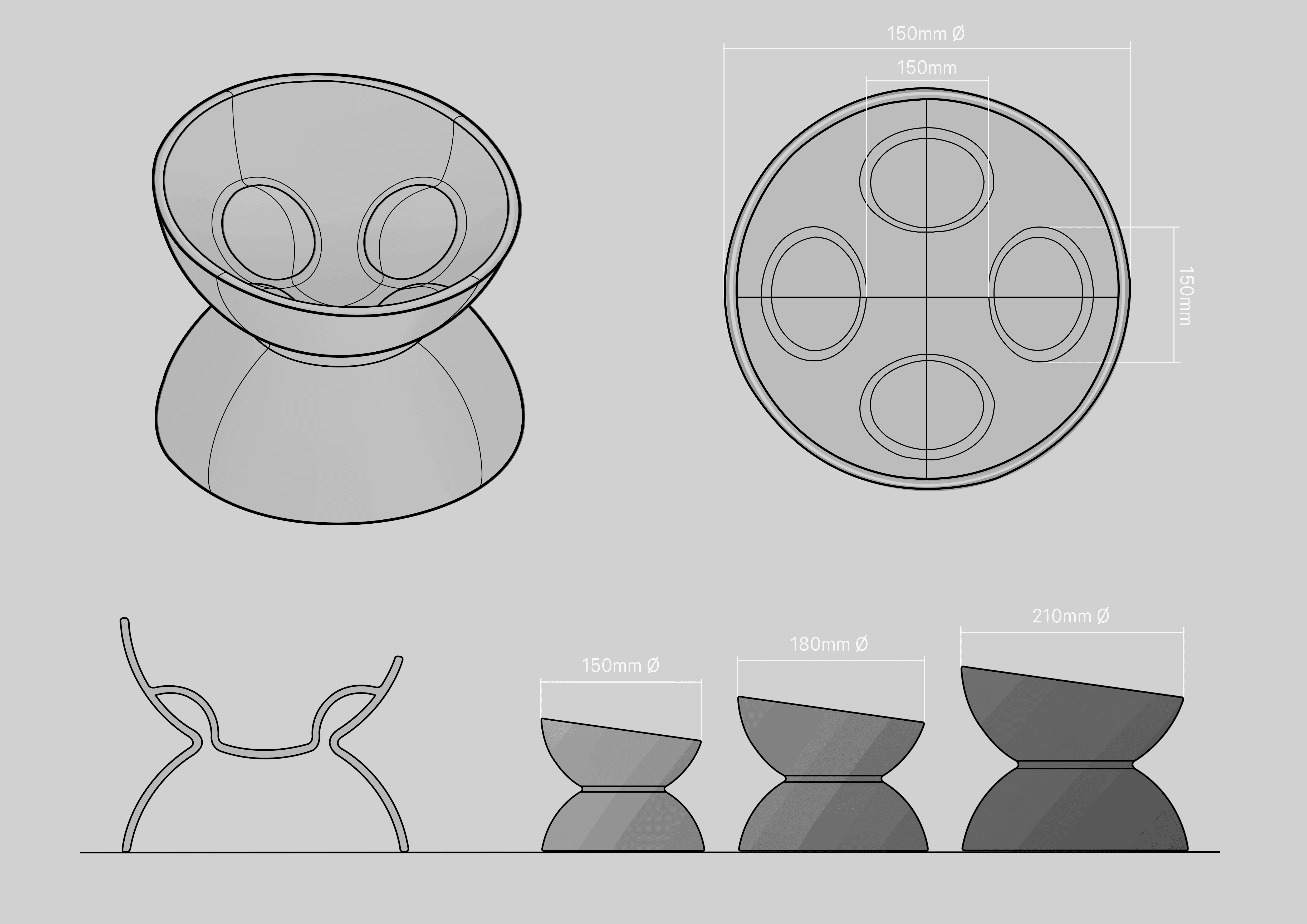
My concept focused on slowing the pets' eating speed. A common reason for pets being messy is because of the speed at which they are eating, slowing this process helps reduce debris and also improves digestion.
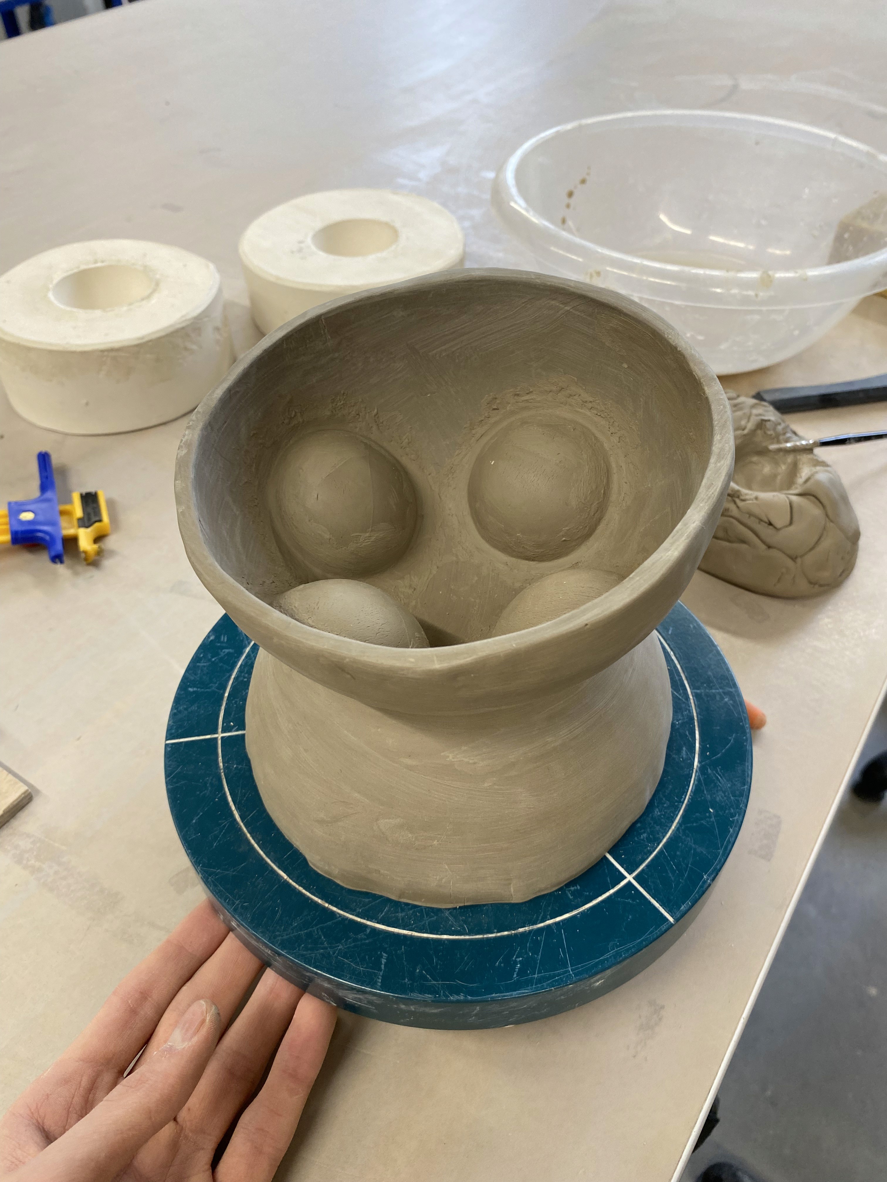
As for the design of the bowl, I wanted the product to look inviting and fit aesthetically into the home environments in which pet bowls are kept. I achieved this by using repetitive dome shapes throughout, I think the result of the design is quite iconic due to its simplistic aesthetic and unity in form. To implement the slow feeding feature I positioned four bumps evenly into the inside of the bowl, they are not too intrusive but are still effective in their function. This makes the product easy to clean and handle, offering benefits to the owner too. The bowl is raised to allow for a more comfortable eating position for the pet which also gives physiological benefits to the animal.
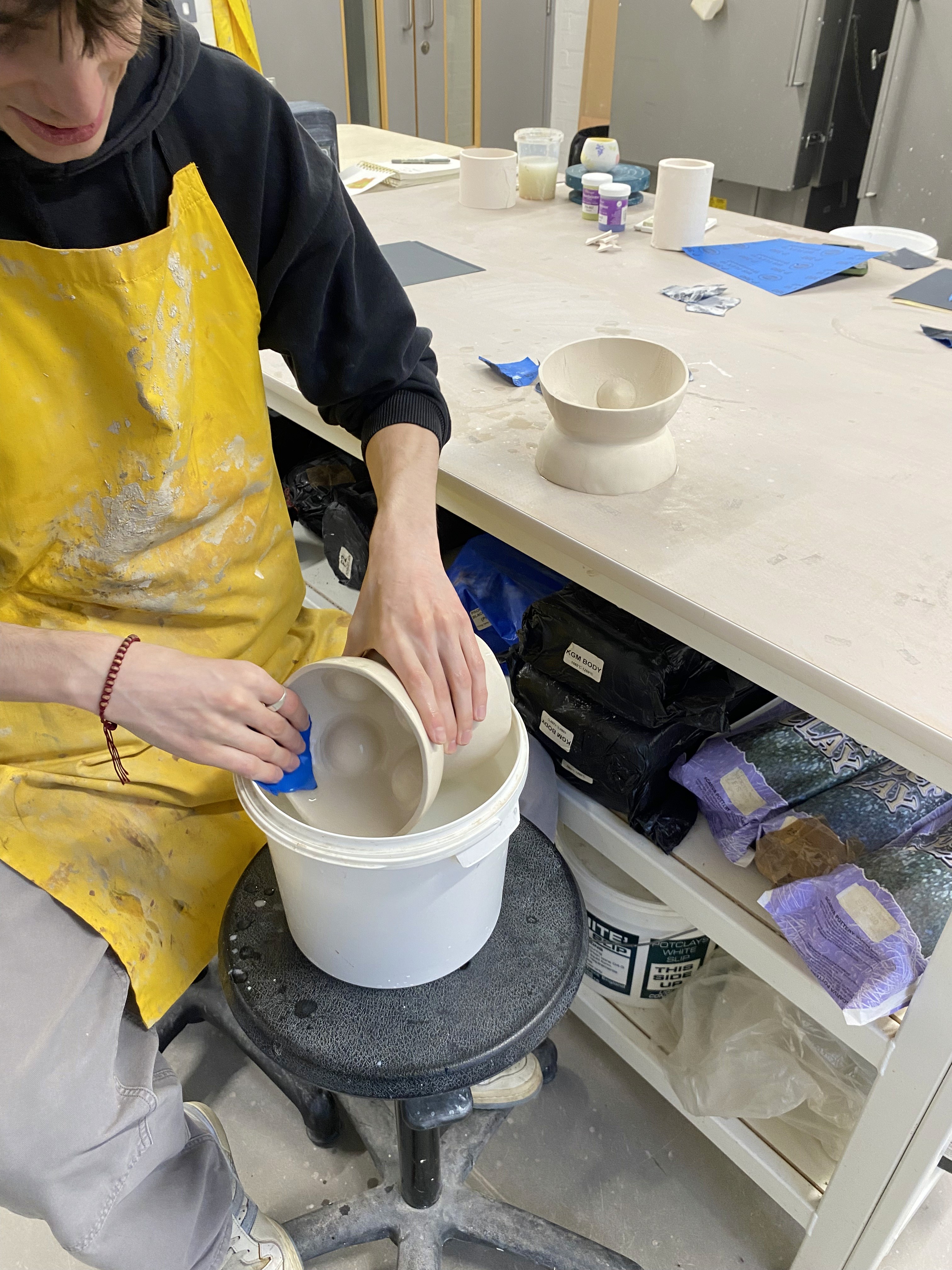
Prototyping.
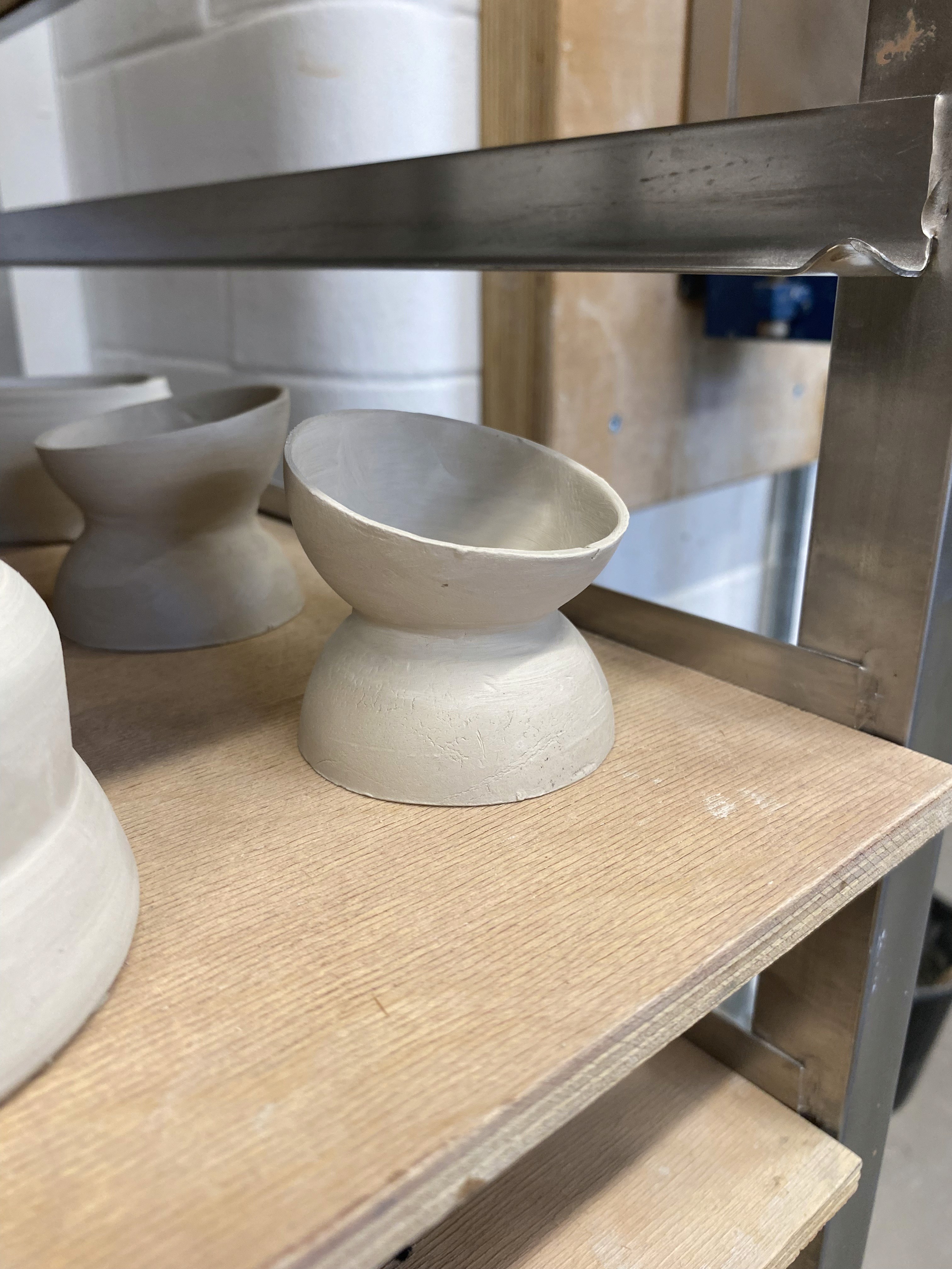
To develop my concept I started making some models of the design. This gave me something I was able to experience physically and therefore make better-informed design changes based on how the product looked but also how it felt when handled. It also allowed me to learn how the design might be manufactured which could influence design choices, I wouldn't be able to consider this just by sketching a variety of concepts.
After I established a technique for making small-scale models to help develop my concept, I was able to make many individual models each with a small development in design to experiment with what works for the product. I was able to use a really small sausage of clay around the point where the two hemispheres connect to get a less sharp transition between the two shapes, this gave a softer overall aesthetic to the product as it eliminated the harsh edge that appeared before.

Product Renders.
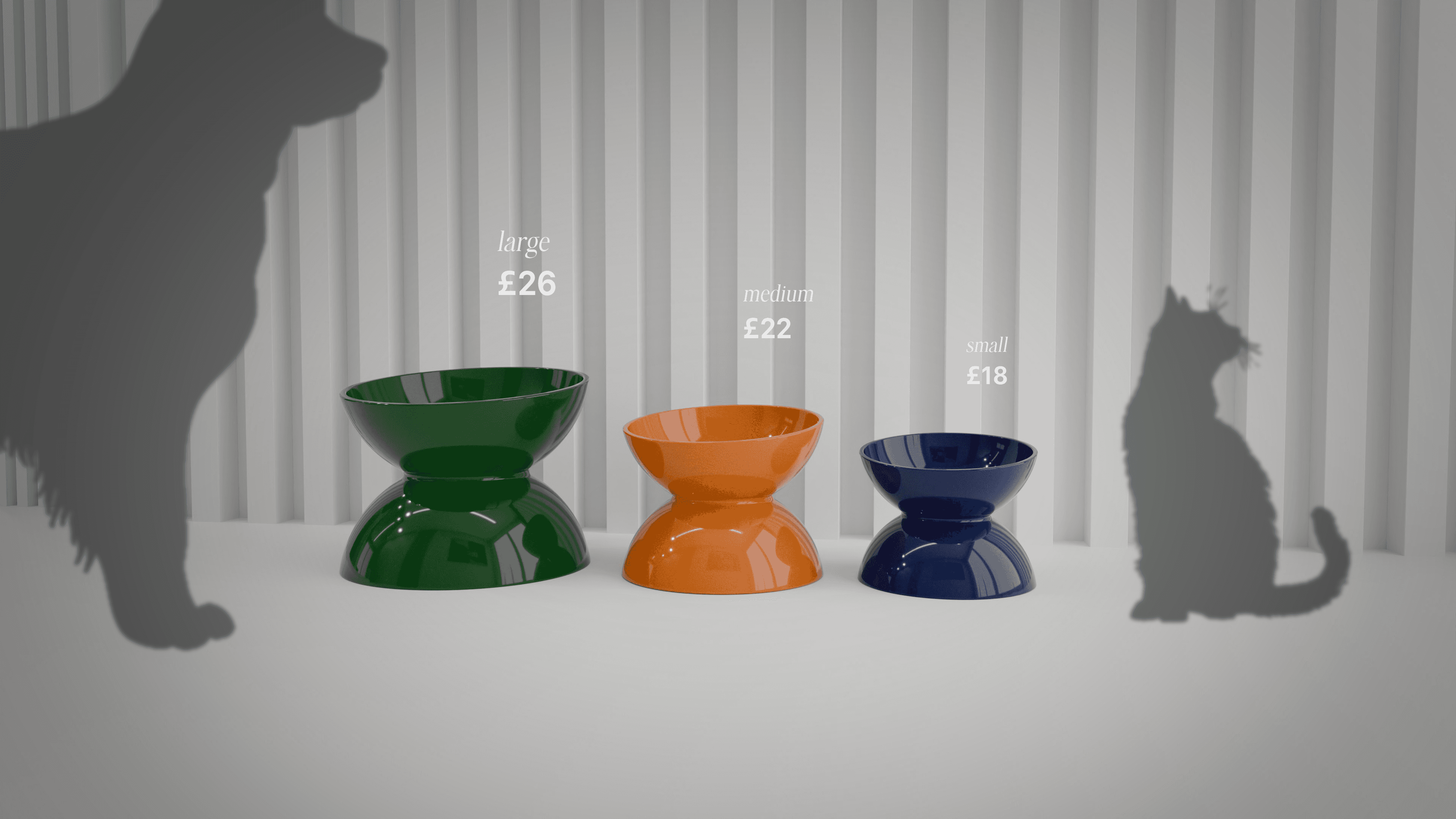
The product will be available in 3 different sizes to accommodate different-sized animals. To showcase the different sizes in the renders, I wanted to display them with different colours that could be sold to accommodate different customer preferences.
I chose these three colours because of their bold strong tones. I didn’t want to pick the standard primary colours that Habitat used for a lot of their products in earlier decades because current Habitat products use darker or lighter-toned colours


Advertising Strategy.
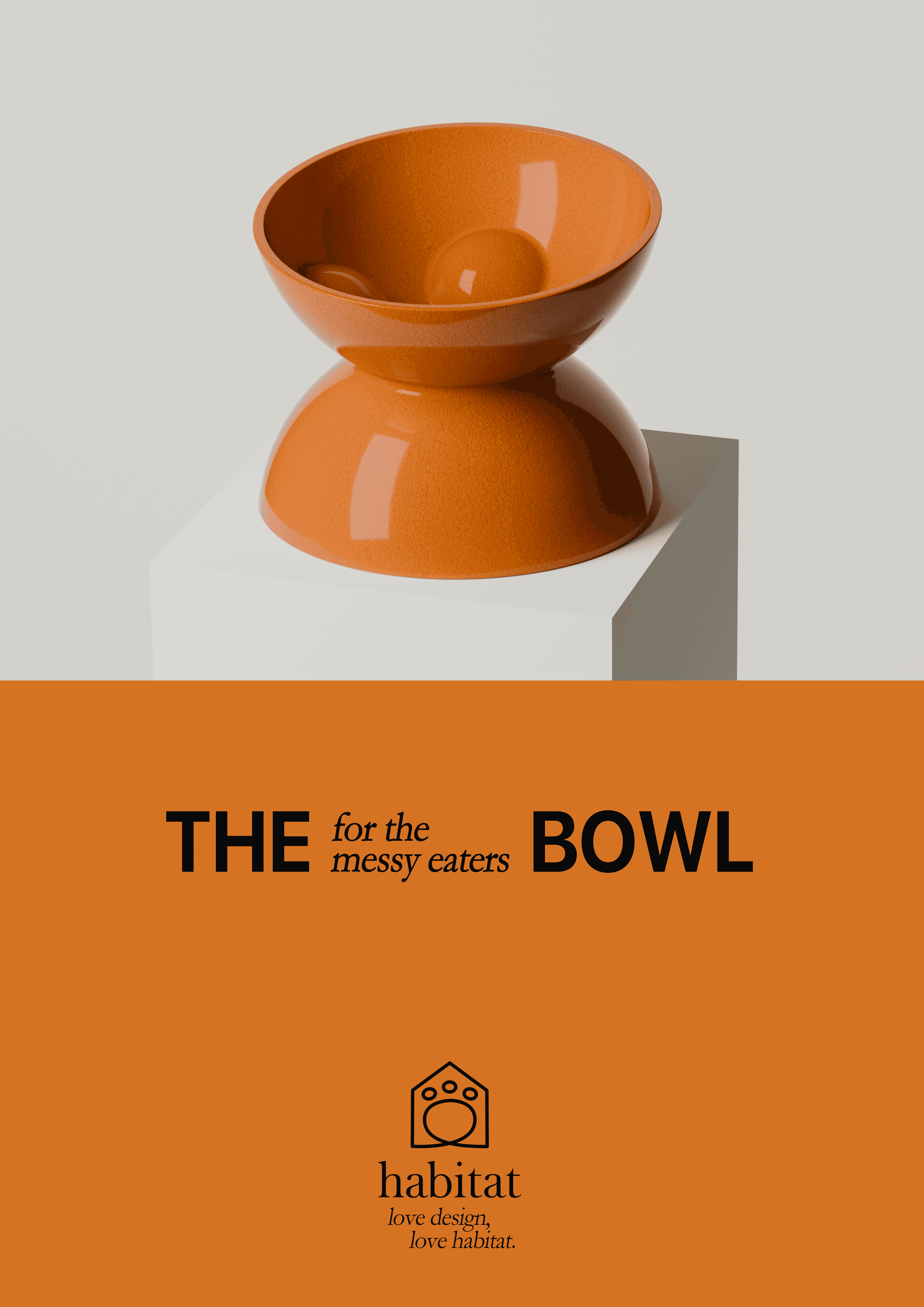
I plan to present my product to Habitat in their style of advertising, which uses bright bold colours that are taken from the featured product. The products are pictured in the environments that they'd be placed in a home to give viewers inspiration to how it could look in their home. Including the price next to the product also entices the user to buy the product because of their recent focus on price, providing cheaper products than in previous decades.

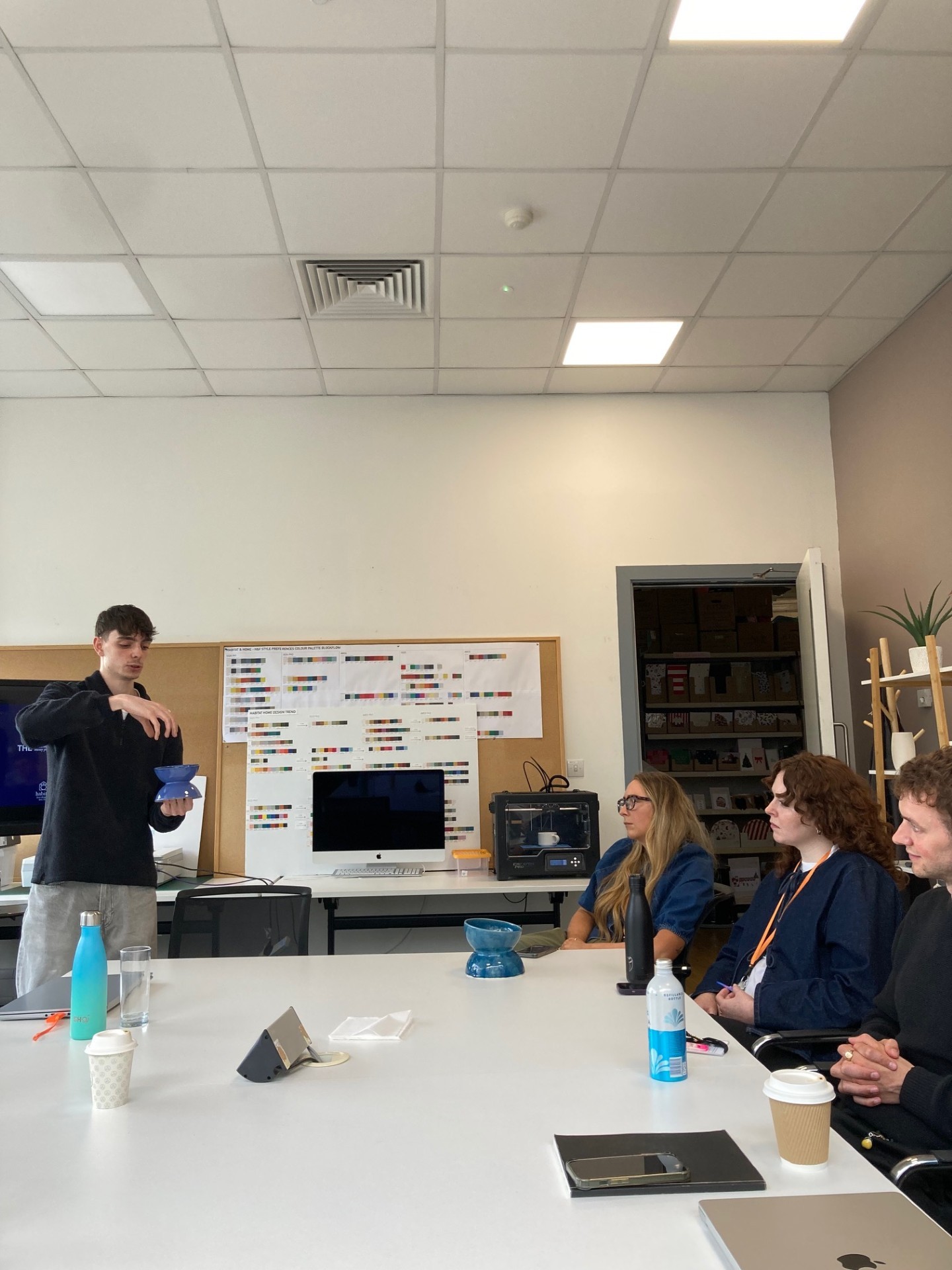
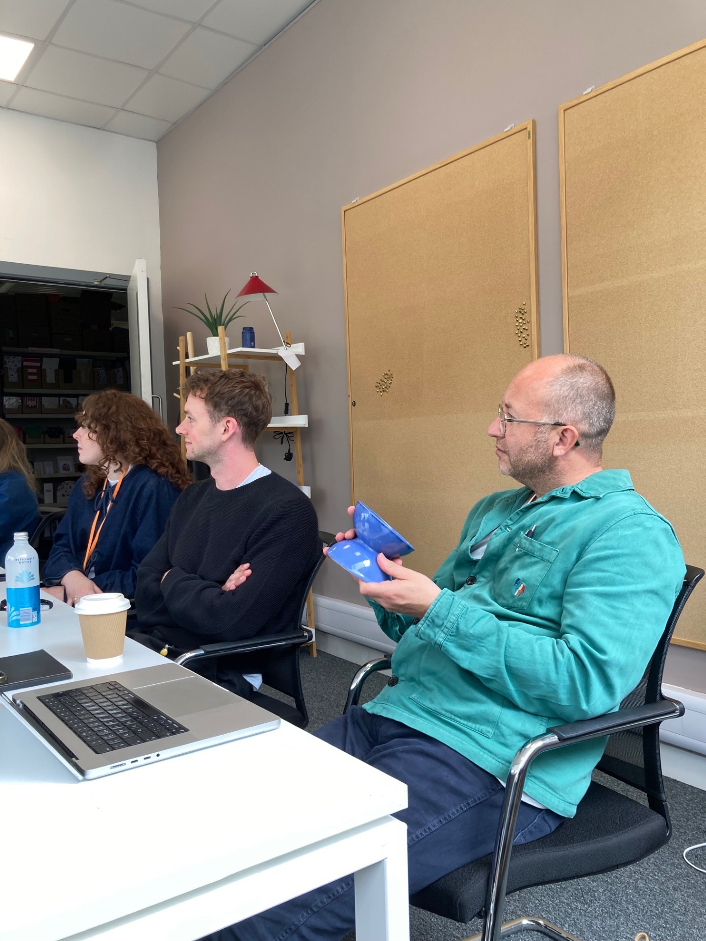
Habitat Design Office Visit.
By winning Habitat's Commercial Response to brief award, I was also given the opportunity to present my project to their head of design, Andrew Tanner. This was a massive privilege not only did I get some great feedback on my project, I also got a tour around their Coventry design studio which gave me an insight to what the work environment of top UK homeware retailer is like and the facilities they offer.